Tuesday, September 19, 2017

Weekly Sector Report | 09/17/2017

Summary

The total market $DWCF advanced 1.66% this past week. We'll look at the relative performance of sectors driving this change.
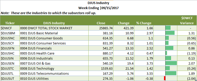
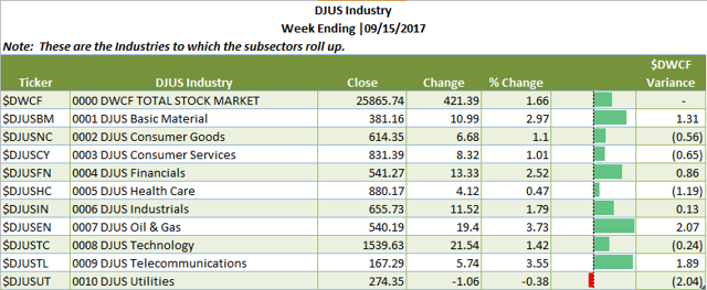
  • Oil and Gas (+3.73%) and Telecommunications (+3.55%) were the top performing industries. Heads up: both have been laggards this year.
  • Utilities (-.38%)  and Healthcare (+.47%)  were this week's industry relative underperformers.
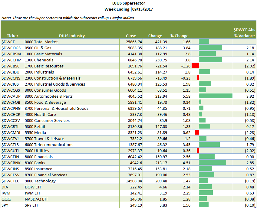
  • The major ETF's were all positive:  DIA +2.14%, IWM +2.29%, QQQ +1.28% and SPY +1.56%.
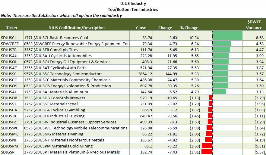
  • Under subsector performance, Coal (Basic Materials) was this week's leader at +10.34%; Platinum and Precious Metals (Basic Materials) was this week's loser at  -3.91%.
Note:  The information contained in this post is in summary form.  You can download a full report in PDF format here. It contains all of the summary tables contained herein plus weekly charts for the SuperSectors + the SPDR ETF's. Unless otherwise noted, all information is sourced from Stockcharts.com
Overview:  The weekly sector report is designed to give you a a bird's eye view of relative sector performance among the industries, supersectors and subsectors using the S&P/DowJones Sector classification. (Get your copy in Excel here).
Using relative sector performance provides a great way to use a top down approach to find underlying stocks that fit your personal investment/trading style. Further, looking at relative performance among sectors on a continual basis helps highlight where money is moving to/from and where to look for attractive long/short opportunities.
With that said, let's take a top down look.
Industry View:  Below are the 10 major Industries plus the Total Stock Market Index ($DWCF). For the purposes of relative performance $DWCF is used.  Table 1, below, summarizes these industries under which more granular the supersectors/sectors/subsectors reside.
Table 1 | Industry View
Industry Overview 

Supersector View. Beneath the Industry View, there is a SuperSector View.  Super Sectors roll up into Industries.  SuperSectors are segmented further into Sectors (which I omit here) and then into Subsectors.  Table 2, below, summarizes the Supersector performance.
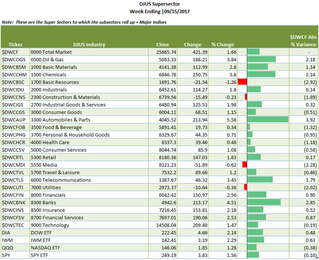
  • Range of SuperSector performance runs from -1.26% for Basic Resources to +5.58% for Automobiles and Parts.
  • In addition to the SuperSectors, I have included the major ETF's for comparative purposes. The number in front of the ticker description is based on the numbering of the S&P/DowJones indexing--it serves as an index number using the first digit for the Industry, and the 2nd digit for the SuperSEctor, the 3rd digit for the Sector and the 4th digit for the Subsector.  For example anything beginning with a 5 is Consumer Services (e.g. 5000, 5300, 5550, 5700). 
  • For chart lovers, I have included a weekly chart book for each of the below as well as for each of the SPDR Sector ETF's (see Table 4).
Table 2 |  Industry + SuperSector + Index ETF's ViewSuperSector 
SubSector View:  SubSector view is the most granular view with a count of 106 subsectors.  While the list is too large to detail here, it is in the weekly report sorted both by sector and sorted by performance for ease of use.  Table 3, below, details the Top 10 Winners and Losers in the SubSector view.
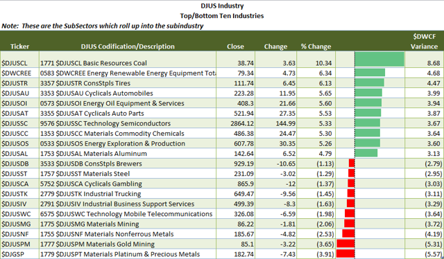
  • Note the difference in performance among subsectors that are part of the same industry (Coal +10.34% v. Platinum and Precious Metals -3.91%). This level of detail can be hidden by looking at a higher roll up (sector/supersector/industry, respectively) which is why I break it out here.
Table 3 | Top 10 Winners/Losers Subsector View
top10winlose

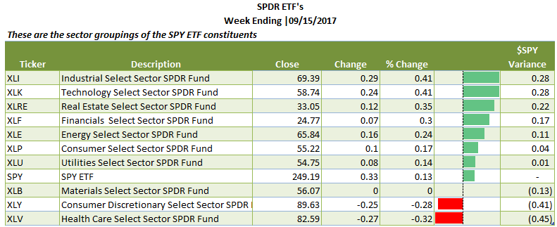
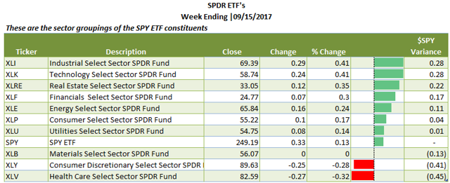
SPDR Sector ETF View:  As many are familiar with the SPDR ETF Sector views, essentially the S&P 500 stocks (a sub-population of the universe of stocks) divided by industry classification, I provide that summary table for you, sorted from best to worst performers. I've also included the charts in the chart book.
Table 4 | SPDR Sector ETF's (sorted by performance)
spdretf

Relative Rotational Graph (Table Form):  In conclusion, I want to leave you with a relative rotational graph (in tabular form).  I think that it is a nice one year exposition of the relative performance among SuperSectors + Major Index ETF's compared to the total stock market ($DWCF).  The % change is for one week, but the relative performance is for 1 year. Color coding is as follows:   Green=Leading;  Yellow=Weakening; Red=Lagging and Blue=Improving.
Table 5 | SuperSector + Index ETF's Relative Rotational Graph (courtesy of Stockcharts.com)
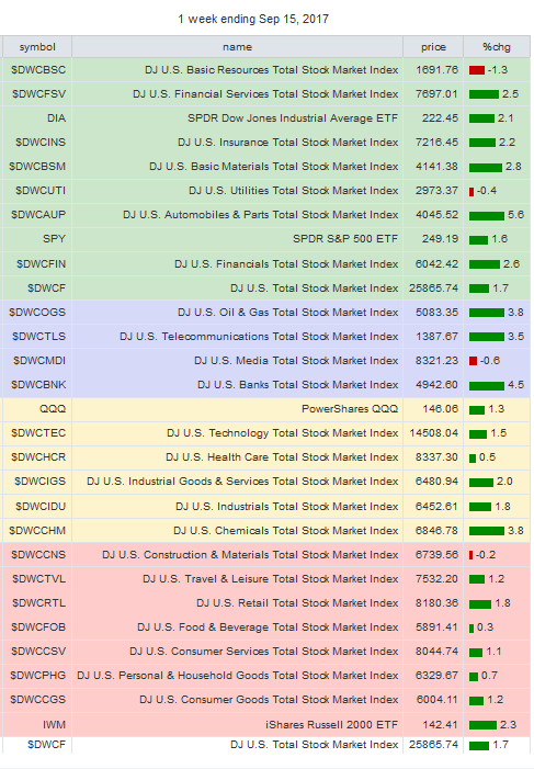
rrg
I hope that your found this Weekly Sector Report helpful as part of your market preparation.


Tuesday, July 04, 2017

AAPL | Volume Shelves

I've always believed that volume matters though I see plenty of folks who claim to have workable methods that don't rely on volume.  That's well and good.  Many ways to take money out of or put money into the market.

I'm in the volume matters category, particularly in looking at Volume@Price.  I wanted to give you a couple of time frame example, a 2 hour and a daily chart of  Apple, Inc. (AAPL) chart. (Click to make larger).

Below is the 2 hour chart of AAPL.The rectangular section in melon shows the volume gap on this 2 hour chart. You can see how precipitously price fell through that area. 

AAPL Volume @ Price | 2 hour chart


Volume@price are profiled differently for different time periods. It pays to take a broad view and look at a longer termed chart.  Below is a daily chart. Watching how price reacts to the longer time frames is constructive.  Let's take a look at the chart:


AAPL Volume @ Price | Daily
As you can see, as we zoomout from a 2 hour to daily chart show further areas that bear watching.  The area from $137.5 - $142.5 is vulnerable if willing buyers don't step in.

  Absent sufficient buyers, the price offered will have to decline and there is no real support in the melon-shaded area. Remember that for every price on a chart there is a willing buyer and seller completing a transactions.  However without sufficient sellers for eager buyers--prices go up; further, without sufficient buyers for eager sellers, price goes down.  I think that it is safe to say that watching what happens to price here is key

It's the longer term players, not traders, that move stock prices over longer periods.  They have to build positions over weeks and months.  Similarly, they have to unload positions over weeks and months.  These longer time frames help keep the price from moving up too quickly in accumulation or down too quickly in distribution.  Here's a chart of the number of Institutions, accumulated holdings (as of 03/31/2017), and portfolio rank.

What this tells us is that as of the 03/31/2017 reporting period, 1,238 institutions held AAPL as a top 10 position with more than half of that group weighted as #1.
Conclusion:  Volume@Price provides an objective, historical record of the volume of stock transactions have taken place at particular price points. Buyers late in the cycle have purchased at marked up prices and get caught on these ledges and jump when price moves against them.  Buyers early in the cycle are buying at discounts.  Once price has appreciated, the marked up price is sold.  Where we are in this cycle is where these Volume@Price ledges tell us. Gaps above provide opportunities.  Gaps below provide warning. Consider adding this indicator to your evaluative techniques.


Sunday, June 25, 2017

Weekly Sector Report | 06/23/2017

I've had some off-line life that took me away from preparing these for you.  I'm back on track. My goal is to share with you Super Sector and Sub Sector performance to give you a sense of where money is flowing by examining relative performance of super sectors and their subsectors. 

We are working in price relative universe.  I use the $DWCF as the US Stock Market Universe and compare all performance of all indices against this backdrop.  You may find the full PDF report here.  You can view as much or as little of the detail as you like.

Table 1 below are the Super Sectors as defined by Dow Jones.  All subsectors roll up into one of the 001-0010 SuperSectors.  Let's take an eagle's eye view and then move closer in.

Table 1 | SuperSectors

Notes on Table 1:  As you can see, the drubbing that technology took in prior weeks was repaired a bit.  Both Healthcare and Technology were the darlings of the week.

In the package that I prepare for you, I outline all of the subsectors.  Table 2 includes the top and bottom 10:

Table 2 | Top/Bottom 10 SuperSectors


Saturday, March 25, 2017

Weekly Sector Update | 03/24/2017

Here's the weekly look at sectors.  You may download or preview the full report here.


The market is sorting things out--raucously. The overall market ($DWCF) was down  For the 23 major sectors, $DWCUTI Utilities was the only winner and $DWCBNK Banks (a subsector of Financials) was the biggest loser. Below is the weekly performance of these major sectors and their comparative with the Total Stock Market Index.


Below are the top 10 | bottom 10 Subsectors


Monday, March 20, 2017

03/17/2017 Weekly Sector Update

I'm late out of the gate on this. First, you can download the weekly report here.

I was not able to run the 24 Sectors for last week; however, you can find them embedded in the larger report.  Below are the Top 10/Bottom 10 Subsectors.


IN the chart books, I made a few changes to the presentation of the charts.  The time frame is weekly.  To each chart I added the Guppy Multiple Moving Averages (GMMA) along with a 50EMA.  I don't typically work with Multiple Moving Averages in this fashion, but I ran across Daryl Guppy's presentation of it.  I was intrigued by using inferred contexts of Traders (short term moving averages) and Investors (long-term moving averages).  Using exponential moving averages, he uses the following indicators to segregate each group.

Short Term Exponential Moving Averages:    3, 5, 8, 10, 12, 15
Long Term Exponential Moving Averages:  30, 35, 40, 45, 50, 60
Because these are weekly charts, the above will correspond to weeks v. days.  I also pulled a 50EMA in an area shading.  I found that this combination of moving averages against the backdrop of the 50EMA provided an nice perspective.

Sunday, March 12, 2017

Weekly Sector Update | 03/10/2017

Last week was one where the market broke sharply and recovered. As I am sector-centric here, I want to present the sector moves for the week.

The table below represents the 24 sub industries.  These represent the major divisions under Energy, Financial, etc.  Not much green.


Below are the Top 10 Winners and losers in the  DJUS Subsectors (these are the further division from above).  Note that the first 2 digits number in front of the name corresponds with the industry code above.  So 37228 (Cyclicals Home Constr) falls under the 3700 Personal and Household Goods.


And I have created a weekly chartbook (in ticker symbol order) for your viewing pleasure which you can find HERE. I wish you a good trading and investing week, and I hope that you find this information useful in bird doggin' opportunities.

Saturday, March 04, 2017

Weekly Sector Report | 03/04/2017

I fell off a cliff due to work responsibilities (my busiest time of year).  I'm back with the weekly sector report for the week ending 03/04/2017.

You can find the complete report here

The report is a large PDF file which you can download or review through Box.com's previewer.  It contains the weekly charts for both the broad industry/supersectors as per the Dow Jones Sector Hierarchy and then all of the subsectors. 

I hope that you find this useful in your market research.


Monday, January 23, 2017

Weely Sector Report | 01/20/2017

Below are the 24 major sectors (alpha order) and their comparative performance to the Total Stock Market Index.  There is an even split 12|12 positive|negative for the week.


I have also provide a chartbook for you for ALL of the DJUS Sectors for those of you who wish to see more granular performance which you can find HERE.  I find that looking at chartbooks provides the best context for understanding discrete market information as it clearly shows which cylinders are hitting and which are missing--e.g. secotor rotation.

Wednesday, January 18, 2017

SQM


Today's chart is SQM.  I picked this up in a chart scan, and I entered a position. This stock has a favorable chart formation on a monthly basis.  The area in green represents the longest volume bar where the price memory may still be strong.

Below is a weekly chart.  I prefer to do my stock scans on a weekly chart as there is less noise.


The chart has made a strong move with pullbacks to the WEMA(21).  It has also pushed through the volume at price bars where the BLUE SKY area, the area I find allows for price to move through easily (chart ether!).  Now, this may not be so, but these short bars tell me that there is not much price muscle memory here $32 - $46.

I found the chart first, and then found the fundamentals.
  • It is a producer of lithium--a favorable commodity in the world of rechargeable everything.  Motley Fool did a write up on them, which you can find here
  • Institutional ownership is less than 20% (per J3SG) -- so there is room for growth here (so long as there is a compelling value proposition.)  (I note that Finviz and J3SG have different Institutional percentages.  I have no idea why.  Finviz notes 43%.  Either one has room for attracting buyers.
I care more about the chart than the fundamentals.  I like this price action, but it is clear that the chart is at a critical juncture.

Anyway, it is worth a look.  I'll update later, hopefully not with a PFFFTTT!

Embracing My Inner Nerd

The importance of having effective systems cannot be overestimated.  I mentioned in a previous post that I led a one-woman revolution and deleted every single chart in my Stockcharts account.  That was 9 years of chart growth.

It took me several days of invested time to rebuild my chart framework.  Utilizing the excellent framework of the the Dow Jones industry/sector build, my charts are presented numerically, so they order perfectly in accordance with their industry/sector, are named with the industry symbol and the sector name.  It creates the perfect index from my summary sector chart book with 108 charts to each of the individual sectors that contains a chartbook for all of the sector constituents.

  "Why bother?" you might reasonable ask.  There are two reasons.

Reason 1:  In test  driving my system this week, and I found that identifying opportunities occurs in a fraction of time of my other 'system': the speed due to the indexing nomenclature that allows me to go from the one list (all sectors) to the many (all charts).

I use the following resources, cobbled together in a fashion that suits my needs:

  • Stockcharts 
  • StockFetcher--this gives more flexibility in sorting and finding stuff than Stockcharts
  • Finviz - gives great profile information and summary information but lacks OTC data and their charting is not to my liking.
  • J3SG.com--provides institutional activity.
  • ThinkorSwim - This provides great granularity for making entries/exits.  
Reason 2:  This 'system' works for me because it suits my personality.  My professional life has always required that I wallow in detail and data to make sense of it.  Any system that doesn't give me that structure, which is how I build my understanding of 'stuff' is incompatible.

In the past, I've not let my system work as intended as I didn't trust what I was seeing because no one else was talking about it.  I want to share these two quotes comes from Justin Mamis, from The Nature of Risk--I offer them because I think that they are the cornerstones of how I feel that I must go about my work.

We need, we crave, the trust and belief from others, but when information is insufficient we need trust and belief in ourselves. We need the discipline to accept whatever is available, and the experience to understand all the ifs, ands, and buts, and yet still take the risk: we need to be able to make the decision. (p. 79).

Discipline means choosing what to do unencumbered by the fear of making a mistake. Confidence means trusting our intuition and that what we 'see' is what we "know." (p. 80)
There are 3 modes:
  1. Researching -- gathering the evidence
  2. Thinking -- integrating and making sense of the evidence
  3. Doing-- taking action on the evidence
 The market NEVER pays us to not take risk.  Risk is where the reward is.  So hand wringing and dithering are not constructive modes.  Accordingly,  the Mamis quotes that I pulled are centered on discipline, experience, trust and action of making a decision. If we have prudent money management and clearly state when we are 'wrong' about a position (time and price), then our risk can be quantified and mitigate.  That means that decision making is free of equivocation (hand wringing, dithering) .

So, my chart reorganization provided me with a disciplined approach to find strong sectors, strong charts in order to become more reflexive in my decision making.  And being reflexive centers on discipline and confidence (like 'wax on, wax off').


Tuesday, January 17, 2017

Weekly Sector Charts_01132017

I'm working my way up to providing a more comprehensive update on sectors.  I'm in a busy portion of my work life, so for now, I'll hit the highlights to include providing a comprehensive chart book on each of the sectors which you can find here.  This is not on the level of what I used to do, but for now you might find it useful.

Below is a list of the top 10 and bottom 10 DJUS subsectors:


Notice that in the middle of this table seats $DWCF which is the total US market--basically unchanged.


Friday, January 13, 2017

Sector Selector | Aluminum

Yesterday's all star sector was Aluminum.  CENX increased 15.3%, but there were several other strong peformers....and a bust for ACH and KALU.


Yes, it was news driven, WTO interested in Chinese subsidies for aluminum. And, per FINVIZ, 23% of CENX float is short.  Sustainable?  Unsure.  But it's worth keeping an eyeball on.

NVO Followup and More fun with Sectors


Bill the Cat sums up the NVO trade. Bad news came out (price fixing law suit) and knocked the chart below moving averages. (click to make larger)

More work needs to be done to repair the chart.  I'm out with a nominal loss as I had a good entry.  I'll let the chart figure out where it wants to go from here.

Housekeeping duties:  One of my housekeeping duties was to take wholesale delete all of my Stockharts' list.  Now, I've been a SC member for a long time.  What I don't care for on their chart lists is that you have to load both the symbol and then name into your chart lists.  Why on earth they just don't populate automatically, I'll never now.

I organized my charts in accordance with the S&P Dow Jones indices.  Click here to download your very own copy.  I downloaded from the website, but then I couldn't find it again--so I just uploaded my copy.

This document is a useful to see in a well organized fashion the hierarchy of sectors.   I created a master chart list with all of the individual subsectors.  I can see in an instant which sector is moving, and then go to the individual sector and see the charts that serve as the constituency for the sector.  Yes,  I LOADED all of the charts for each subsector in individual chart lists.  Yes, it was time consuming, but Excel helped.  I have a master spreadsheet that has the Dow Jones index symbol and all of the charts-it has almost 5400 rows on it.

Here's a snippet (above) of my charting.  I used the DJSubsector number, included the symbol, the industry and the subsector.  (Love concatenation in Excel).  The number ensures that my chart list always stays organized by major industry.

It's "bookish" work, but someone has to do it.  It was an investment in time, because it saves me time.  And while SC has charts by each sector, you can only look at them individually instead of in a more global fashion (e. g. chartbook, thumbnails, summary).  That's just poor design on their part, but I made it work for me.  In my next post, I'll share my chart setup.

Thursday, January 05, 2017

Chart to Share | NVO And Some Sector Stuff that's Nice to Know

I'm back at looking at charts again after being away from it for a while.  I have some favorite patterns that are high probability set ups.  There is always the probability that it goes the other way. So figure out your approach and manage your risks if you are wrong.

 Here's a chart that I would like to share:  NVO  I picked up a position @  $36.24 on 01/04/2017.  I wanted to share why.


(Click on image to make larger)

Context is everything in stock picking.  There is the market, the sector, and of course the individual chart as well as fundamentals.  Frankly, I pay less attention to fundamentals.  I don't have enough time nor interest to research and understand the salient fundamentals even though I am a financial professional.  Rather, I shortcut that by using institutional support as a proxy for fundamentals and do a quick look at summary data (BS + IS + Cash flow).   I figure those folks have the resources, so I'll just tag along and do cursory due diligence.  I never care what insiders are doing, and I never pay attention to that. 

Market and sector sentiment (e.g. what's happening to all the other frogs in the pot) all have to work together to increase odds of success in making a buy (long)/sell (short) decision with a favorable expected outcome.

 I've had many market data geekfests over the years.  One has to honor one's idiosyncrasies, and mine is centered on understanding salient data.  I've limited my data diet to 3 things:
  1. Understanding the contextual dynamics of sector rotation and where to mine that information
  2. Understanding the behavior of Institutional Holders (they are smarter and have more resources than I do) and where to mine that information. 
  3. Understanding how items 1 + 2 manifest in charts.
  4.  

 Sector rotation is a powerful thing....and the pharmaceutical sector's down draft is one that shows the effect on prices. Accordingly, my focus on sectors is one that points me where to look.  For me, I look at the 24 sectors, and then the 145+ individual sectors.  The sector performance is a signpost of where to dig for opportunities.

 I have all of the sectors (major + sub) mapped  in Stockcharts. I used to publish a weekly sector report on my charts to make it easy for others to see the work more elegantly  I may reprise that work.  For now, I use it as a gauge of understanding of what is going on in the church of what is happening now.

If you start to look at sectors regularly (e.g. a disciplined approach), you will realize that there is always a bull or bear market somewhere.  Let's take a look a pharmaceuticals of which NVO is a member of.  It is represented by $DJUSPR. 


(Click on image to make larger)

Pharmaceuticals tumbled 15.5% from August to early November due to the well-earned negative publicity regarding drug price overcharging.  The entire industry was out of favor as chart after chart will show.  But no need to look at lots of charts. We can see the encapsulation in this index.  Click here to be transported to the excellent WSJ FREE resource for this sector and explore other sectors.  Note that the Dow Jones index for any sector is composed of X number of items while the universe of stocks that populate that sector is larger.

For example, below are the eight stocks that are constituents of the he Pharmaceuticals Index.  Notice that NVO is not one of those; rather, it is a sector constituent along with 84 other stocks.  As these index stocks go in composite, so goes the index. Naturally, the other members of the sector are going to feel the emotions that are governing the index.   I encourage you to go to the WSJ website and explore, it is an excellent, free service with a wealth of tools that will allow you to see the market more broadly.


That's a long preamble...

As you can see from the DJUSPR index, it is making a nice "W" bottom recovery.  I picked up the NVO chart on a scan looking at compressed volatility and then did my due diligence.  Here's what I like about NVO:
  • In a sector that is recovering
  • Is showing recovery (accumulation) on its chart
    • prices are consolidating in a narrow range foreshadowing a range expansion (up or down--no one has a crystal ball)
    • volume is increasing
    •  volume air pocket above denotes a low volume of potential sellers waiting to ease their pain should price move up.  My experience is that such volume profiles attract price movement as there are not a lot of eager sellers. (The converse is if there is a large volume bar and low pockets below.  The sellers are in your current volume bar and if price drops they sell).
  •  It has excellent institutional support (though I qualify that below)
    • Renaissance Technologies holds this as its #1 position as of 09/30/2016.  Below are their top 10 holdings from J3SG.com (fabulous, free resource).


And I will close with the top 10 Institutional Holders in NVO.  Overall, there was a reduction of 10M shares among the top 10 holders. This number is not insignificant.  Institutional holders will need to step in to make this price expand into a higher range.  As this data is as of 09/30/2016, the 12/31/2016 filings might show

I'll be publishing more charts that I like. None of these are recommendations, but perhaps a little bird-dogging to show you some places to hunt.

Friday, December 30, 2016

New Year

No one is more ready for a New Year than I am.  I'm ready to toss this wretched old thing to the curb.  In addition to personal tragedy, the political silliness and meanness was stressful, sad and exhausting.

If I were to have one wish for the new year, that would be to compel our leadership--no matter which side of the aisle or ideology they stand to embrace the precepts embodied here:

In the time of war
Raise in yourself the Mind of Compassion
Help living beings
Abandon the will to fight
Wherever there is a furious battle
Use all you might
To keep both sides' strength equal
And then step into the conflict to reconcile.

Vimalakirti Nirdesa
I've had this on my Wisdom Page for a long time. I was compelled to come back to it this year.  It is simple.  It is powerful.  It is a singular call to action.  It works at any level of our personal or political lives.


Wednesday, December 28, 2016

Process

I found myself discussing the importance of 'process' with someone recently.  The essential:  If the process is well thought out and well executed, then the outcome will be shaped accordingly. This was my observation shaped by decades of business experience.  I was speaking specifically in terms of leveraging the expertise of different constituencies to tackle large organization/institutional initiatives.  But it applies to solo endeavors as well. 

What am I talking about?  I'm talking about the importance of overlaying a solid process to achieve a desired outcome.  It means that whatever goal we are tackling, our process that we develop (and follow!) toward achieving that goal is one of the greatest predictors of our success in reaching that goal.

Some examples.  If we want to get physically fit, then we need an exercise plan that will incorporate nutrition, strength, cardiovascular and flexibility components to achieve optimum results.  If we want to be fiscally fit, then we need a financial plan that will incorporate proper savings and spending levels, and an investment plan that makes sense for our risk profile.

Hopefulness that in our doing nothing will yield great results will universally result in poor outcomes--unless one is extremely luckily.  My sitting here typing coupled with great hope that my cardiovascular fitness will improve will yield a disappointing result. Living beyond one's means consistently will not yield good results for long term savings.

There are many other types of examples. Regardless of our goal, the same overlay stands: a considered approach to any desired outcome is the result of good planning and hard work.   Thus, the aphorism, "Luck is where opportunity and preparedness meet."

Notwithstanding our  best efforts to consider all things in our plan,  we can be certain that unanticipated events may unfold.  No one has a crystal ball.  No one.  So when such things happen, having some grace and courage under fire helps us craft Plan B. There's no shame in having a Plan B.  I've been in business situations where I have had to have a Plan C in addition to A and B. 

The key to successful execution on those plans (any plan) is simply to say if "X" happens then I will do "Y".  The discipline is to not shrug when "X" presents itself, but rather to act.  If I have another accident in my car, I will take driver's lessons.  If my weight gets beyond ###, I will cut back on sweets. 

Simply put: 
  • Set a goal.
  • Define desired outcome(s).
  • Plan a strategy.
  • Execute a strategy.
  • When shit happens, adjust accordingly.

Shit always happens which is why it was my favorite bumper sticker in the 1980's.  True then.  True now.  Naturally the upcoming New Year is rousing such thoughts.  I'm going to dial back to 2008 when I produced a Mind Map of my resolutions...(Rummaging in blogger bin......)  Here it is.


It is sad to have to put 'fun' on a resolution list.  But this was my "balanced score card approach".  It does work...so long as one maintains the rigor of managing by it.


Sunday, April 17, 2016

The Big Short

I haven't posted in this space for more than 4 years.  I watched the movie, The Big Short, weekend before last, and I was reminded of much of the good work/research that I had done in this space. There was a point where I didn't think that I would want to view the movie, as so much of it seemed to be a "been there, done that."  Due to some DNA quirk, much of the 'subprime is not a problem' fell false to my ears.  Accordingly, I spent an inordinate amount of time doing amateur research; but I did it, doggedly.  And what I concluded was that there was no way that subprime would not be an issue.

There were several things that led me to that conclusion--not just based on general ramblings of others. You can see some of what I wrote here on subprime, and what I wrote here on hedge funds and systemic risk.

  1. First and foremost, the average income (for people who had income) to loan balance ratio for issued mortgages lowered considerably. Naturally this was a requirement to be able to sell over valued homes.  Runaway home-prices + easy money.  This statistic has NOTHING to do with subprime, but everything to do with stupid underwriting.  And I dug through the information published by the government to find this statistic.  Again...no one reported on this salient fact.
  2. The risk curve on the mortgage insurers underwriting reports had shifted to the left.  Meaning that defaults were happening more quickly and in greater number.  None were reporting on this published fact (but there was lots of conjecture--correct conjecture).  The supportable facts were there.   I found these reports on line after a bit of rabbit holing on line, and once the fan blades were flinging dung they were soon yanked and not available later.
  3. All of the banks were still basing their loan loss reserves based on passed delinquencies, per my review of the financial statements of both mortgage lenders and the mortgage insurers.  I didn't understand that in relation to number 1 above.  I also don't understand why none were reporting on this--it was one of the easiest things in the world to discover and it was something that was worthy of being reported.
  4. The amount of synthetic instruments (credit default swaps) were not reported on any exchange. Accordingly, after reading some information about what happened in 1929 and the role of off-exchange instruments in the collapse, I believed that there would be a problem.
  5. That insurance companies who heavily invested in bonds had balance sheet risk was not anticipated in the news outlets.  My research (and I wrote about it in this space) told me that it would.
One of the things that I identified with in the movie is the "early is wrong."  Most palpable to me was the emotional wringing that these guys went through--to be 'right', but not seeing evidential matter in the market prices to support their positions.  I though the movie did a great job of conveying that angst and inner turmoil.

Finally, the tongue in cheek nature of several of the asides to explain some of the technicals was inspired.  The complexity of all of it is snooze worthy--but having the likes of Selena Gomez, Anthony Bordain explain it made these concepts accessible.

I may spend a little more time looking at a few market 'things' and posting here.

Friday, February 03, 2012

Hiatus

The Perplexed Investor is busy with real life stuff.  With that said, I'm on permanent hiatus from observing/writing about the market.  Given that I have much hard work and some fairly good observations in this space, I'm not yanking the blog just yet.

Thanks to those who have been patient and gracious readers over these last 6 years.

Wednesday, November 02, 2011

SPY Chart | 11/02/11


Above is a 60 minute SPY chart with a volume@price overlay.  As I've never shaken my belief that charts tell us nothing so fully accurate as price history, I do look at where the market has voted with its collective wallet. It is these places where the inextricable psychological and economic investment shows up--and where breaches of these areas (to the upside or the downside) are likely to elicit a reaction (buy to catch up or  Neither pundits nor technical analysis have any dibs on future certitude of market direction.   Since my last post, the market seems to be reacting to its current (in)digestion of news out of Europe. 


Euphoric, despondent and incredulous are all apt emotions that the market has experienced.  Who knows what it will bring today?  We are entering a area of important price support (to my eye anyway).  Likely to be more chopping as market participants try to digest the Euro stuff and the MF Global debacle.  And the MF Global evaporation is a reminder that the so-called smart money, is not so smart (said with schadenfreudic sarcasm).


Monday, September 19, 2011

Deja vu


The market these days is reminiscent of the pre-Lehman/Bear Stearns market.  The markets were hyper-reactive---with maniacal swings up and down. As I had done so much research and understood the factual underpinnings of the events (before they unfolded so dramatically), I was able to evaluate statements made by various talking heads.   I was not assured by assurances.

Rather, I understood clearly the systemic risk potential before anyone was talking about it. I had invested hundreds of hours of personal research to understand the unfolding risks.  I read financial statements (of mortgage insurers, insurance companies, mortgage companies and the investment banks) and saw the loan loss reserve and derivative language which told me that using historical methodologies in the sans-sane underwriting environment was going to lead to sharp losses.  I read the S&P, Fitch and Moody's reports which FGIC published on their site.  They no longer do. Most importantly, I understood that systemic risk would collapse all asset classes--there is no basket of diversification that would be safe.   And as we soon found out, even some safe classes--money markets--were not safe.

This research made my head hurt.  The only industry I had a passing acquaintance with was the mortgage industry and that was from audit experience very long ago.  I found the investment bank financial footnotes overwhelming.  But I read them. I thought the insurance companies would be at risk because of the amount of fixed income securities they bought.  Turns out that I was right.  I saw no analyst or talking head suggest that this was a sector that would suffer.
Sure, many were talking about the dangers of derivatives and agressive lending, but all of the doom and gloom centered on a symptom of the problem, subprime.  Rather the entire housing industry that was in a bubble due to easy money for all--just not subprimers.  A few hours at the OFEO site and reviewing their statistical reports for average earnings of households to average home prices and a 2 minute calculation  indicated to me that the problem was sorely underestimated.

The new designer mortgages were not to get undocumented folks into homes, but to get "normal" households into homes where the home values as a multiple of household income had increased markedly (39%).    From 2000 to 2006 housing values increased 76% while household income increased 27%.  It is worth noting that home values increased even more post 2006--but my research was in 2007, and there is no need to update it.

Now, fast forward.  We are awaiting another clown-sized shoe to drop in the form of the European 'stuff' and in the form of no new jobs creation for the US and the threat of a a continuing (or new) recession.    Hard to know if it has dropped already or if we are just cowering in its shadow as it hovers above. My only surprise is that it has taken this long for the giant festering pustule of the Euro-centric economic mess to finally pop.  Similar to our own issues in 2007.  The demise of the banking industry was long foretold in 2006 and so. It takes a while for these whispered, muted fears to take on gut grabbing terror. However, today, I do not feel buoyed by the certainty of my research.  I do not profess to understand the intricacies of what is going on in Europe. 

There is a great paper called Irrational Optimism (Dimson, Elroy, Marsh, Paul and Staunton, Mike, Irrational Optimism (December 2003). LBS Institute of Finance and Accounting Working Paper No. IFA397. Available at SSRN: http://ssrn.com/abstract=476981 or doi:10.2139/ssrn.476981).  It is worth your taking time to read.  Here is the first paragraph from the abstract:

We address the tendency of many investors to overestimate the rewards and underestimate the risks of investing in stocks over the long term - that is, investors' irrational optimism. In particular, we examine the widely held belief that stocks are a "safe" investment for the long run. The probability of experiencing a real loss on equities depends on the expected real return and standard deviation of stocks. Judgments about the future magnitude of these two parameters typically involve extrapolating from history. We use a global database of real equity returns from 16 countries during the 103-year period from 1900 through 2002 to confront the optimism of investors with the reality of history
While I feel somewhat ill-equipped to know with any certainty of what is down the road,  I do know that ultimately we have to rely on our own judgments of the risks. Dimson etal's paper is one that helps illuminate perceptions, and I try to keep the valuable perspectives in that paper at hand.   If we could learn anything from the last bout of certitudes where the eventualities of the collapse of the dollar and treasuries were 'no-brainers', we should learn this:  conventional wisdom in unconventional times is not worth much.