I'm not a techno-weenie. I have a program call HyperSnap from Hyperionics which is a screen imaging program. I like it very much, and in fact, this project gave me the opportunity to use more of its capabilities. To remind you, I was using the Metastock sector/subsector categories and creating them in Stockcharts. Why? Because I think that Stockcharts has greater "bird's eye view" capabilities.
Unfortunately, there is no way to print these symbols underneath the sector umbrella. Therefore, I would take a picture of the screen. Hypersnap has a function that will automatically scroll the screen down to the end and capture the picture. I would then print the Hypersnap doc and manually enter the symbols.
Toward the end, I found that I could use the "TextSnap" functionality. It puts the tickers in a column in Hypersnap. I needed them in symbol-comma-symbol format. I copied them into Word and then wrote a macro to delete the hard return, insert a comma, insert a space etc, etc. I was so proud of myself. It made the last of this arduous process go by much more smoothly. Essentially it converted
ABC
DEF
GHI
JKL
to ABC, DEF, GHI, JKL
I use Hypersnap quite a bit for most of my blog images. If you do not have a robust screen/text capture, I would recommend this program. It is very inexpensive. You can find out about it here. There may be better programs, but I'm only familiar with this one.
Now, what did I accomplish? I've created a pretty comprehensive list of stocks that I can view easily by sector. I believe that understanding sectors within the current economic cycle are very key. If one is not attuned to how the sector is performing within an economic/business/interest rate/market cycle (they are inextricably linked) then one runs a pretty great risk of buying at a disadvantageous time EVEN THOUGH THE FUNDAMENTALS ARE TERRIFIC.
Case in point: Real estate investment trusts.


 Here's the "Big Picture:
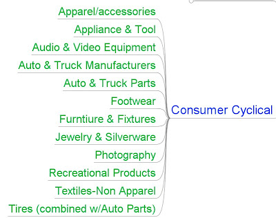
Because of the size of this chart, I'm going to break the sub sectors down for you so that you can read them easily


-----------------------------------------------------------------------------------
As you can see, this was quite a project! But I wanted to be able to do this:

3 comments:
I am trying to understand this Project, or at least the end result: the final list you have posted. I have two questions: 1. Why did you select the stocks included in this Project? 2. Reading the list how do I see a picture of sectors, rather than or in addition to the individual stocks. I guess I am confused.
Or ignorant. And perplexed. Thanks, Caren
Hi Caren. Thanks for your question. I'm sure that I did not present this clearly.
I've portrayed two things. The first thing was the sector-subsector universe from MetaStock. The final item that I provided was merely all the stocks (that MetaStock listed)in one subsector, Basic Materials: Chemical Manufacturing listed in order of performance from Friday. I did cull through these stock lists and delete all stocks that were trading less than $1.
The final view that I presented (which is just a subsector) is the gravy of what I wanted to accomplish: the ability to see relative performance of all stocks in a sub-sector. I can create that list (view) for EACH subsector in the sector universe.
The population of names allows me to familiarize myself with the members of the subsector family. When I run across names that I'm not familiar with, I like to briefly research them. Sometimes they are too small, not liquid enough or broken companies. BUT, some of them are quite interesting and present an opportunity to consider further--and upon doing so they appear to be a hidden gem. My style is that I like to be in these stocks (and if they are truly good, someone will recommend them) prior to everyone else.
I've done a particularly good job of finding these gems only to question my judgment and exit before the party gets started. Trust me, I was in TNH before ANYONE was in TNH--I could also tell you what each $1 increase or decrease in nat gas would do to their bottom line. $19 was my entry price! I think it went to $145 or something ridiculous like that (I'm not going to look!).
I listed one such company, Chatham, in a recent post. It is not a stock whose name is bandied about, but it has been a monster performer. Those are great stocks to build a position in.
My project, then, has provided me with an infrastructure within which to "watch" stocks within their subsector family.
I hope that answers your question.
Leisa, thanks for sharing your impressive data collection & organization.
r. saunders
Post a Comment