For folks who are coming to this post from a search, my point is to do three things:
Thing1: Ensure that you know about CSS Tab Designer
Thing2: To describe how this amateur adapted it to Blogger.
Thing3: Describe some of the tools that I've used.
First, a bit of background. I know nothing about web design--I'm an executive financial person. Okay, I'm a bit of a nerd and very curious! I wanted to be able to provide some personalization of my blog, so it would not look like other blogs. The blog that you see here is a Blogger blog. I uses Doug Bowman's Minima Black. I've managed to do some customization. Trust me, I did it the hard way! But here are some things that you can do if you take a bit of time--naturally, I'm expecting my post audience to be someone with little to no experienced--same as me!
You have to understand that Blogger templates are just that, templates. You can customize them, but you have to be take your time and think about what you are trying to accomplish. It's like building a house--and if you change the design/measurement of one component, you have to look at see if that component affects other areas. This post is not about how to design, but rather to give the amateur blogger a sense of possibilities. Perhaps you are much smarter than I am and understand this stuff so intuitively. I had to make a rudimentary pass at CSS design. There are some great resources. I found this resources to be very helpful (click on image):

You will learn some basics about CSS language to help you with "stuff". Some "stuff" that you can change on your design:
- Colors--text colors, background colors, post headers, date footers etc.
- Size of the areas. There's an outer wrapper, an main wrapper (where you blog) and a side bar wrapper (maybe 2 if you have a 3 column blog). All of these areas to including padding have to add up to the outer dimensions.
- Text: size, style, margins, indention and of course color!
- Header image, list images (dots, bars, etc), sidebar header images.
- Borders
- Third party functionality through widgets.
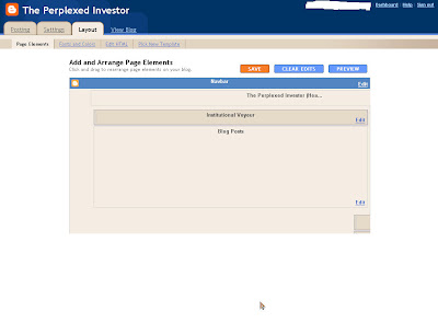
Also be warned that if you expand your space (outer/main wrappers), when you go to layout, you'll lose the lovely sliders. You'll think for a moment that you've lost the ability to get to those out of reach spaces to the right. You haven't. Just use your directional keys to scoot over there.
--------------------------------
See, everything is cut off to the right, and you need to get to that stuff! Up/down, right/left arrows will get you there.
Now I'm going to segue into using CSS tab designer in a Blogger template. I hope that I have not sacrificed simplicity for thoroughness. You could use all of this code without using the CSS Tab sheets, but you'll need the graphics. Plus, the tab generator makes generating the list easy. Here's the overview.
Part 1: Get the Software and plan your list.
- Download the software. You can do that here.
- Plan what type of list you want, and any external links required.
- Review the styles available (they are so well done, you'll find one that you like!)
- Create the list using the downloader software in the style that you like.
- Print out the HTML text (it will help you in following along).
- Find the graphic for the menu item you've selected. You will need to search for *.gif--inserting the menu item name for *. There may be more than one. You will find them in this directory: C:\Program Files\CSS Tab Designer 2\styles\Tab Menu 12 with the last backslash containing the file name that you are looking for.
- Make a copy of your current template.
- Do not skip the above step.
- Create an Element (see below) for your new tabbed list.
- Copy code into the Element--this is the WHAT you want listed.
- Copy the code into the HTML of your blog. This code will tell you HOW to display the information in your element.
I would suggest that even though you've copied the your template, if you are really an amateur (like I am), that you create a test blog. I did (you can see it HERE). This is where I fearlessly tried new techniques with no regard for the consequences. If only we could have an alternate life where we could do that! In fact, you'll see where I was experimenting with lists. This example is "new menu list"
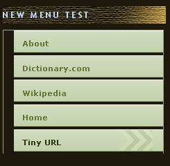
To begin with the end in mind, here's the list that I created.
As you can see, I've still not got it lined up right!
Here are some things that I did not fully understand in the beginning.
- Custom (and hopefully interesting) design elements (look at my side bar headers for example, though you may not find it interesting) are images that are being pulled in. I use box.net for my image hosting as well as to upload stuff for my readers. There are other places, I just stumbled upon this one first.
 I'm not endorsing them over any other, but it's a place for you to start looking. Click on the image to be transported there.
- Your images must "fit" your application, otherwise you will have to repeat them, and some repeating images look odd.
- You may want to create an image--to do that you need to have a program that will allow you to manipulate the size and style of the image. I have Adobe Photoshop CS2. Most people have the Free "elements" and you can do quite alot with that. There are also images that you can find on the internet for free.
For the menu item shown above, the software creates an HTML code. I uploaded a Word document with the menu code that you can find here. Because this is code, if I insert the code here, it will present what the code is programming.
Note, all images that I present here can be clicked to make larger. My comments are in blue. As a reminder, you are doing three things:
- Thing 1: You will have to change your HTML text in your blog document. Make sure that you save your template first. REALLY--save it.
- Thing 2: You are creating a new "element" to provide your customize menu of whatever (it can be a list of wines you like, websites you visit or music. (see below)
- Thing 3: You have to search (on your computer) for and find the .gif for the designer template for the menu graphic that you want to use AND upload it to a host.
Figure 1: Are you unsure how to add elements or which type? View your blog; click on the "customize" link in top right and then choose "add element". You will then see this page of choices:
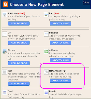
Choose the HTML/Java script. You'll use this for any third party widgets where you are cutting and pasting code. It's nice to know how to do this. Call it Menu 1 for the moment.
Figure 2: Here's a picture of the top part of the HTML text that the CSS template software generates when you complete your list.. Your blog template (that you've already downloaded, because you are never going to make changes to it without saving, right?) is a larger document. You want to ensure that you have not conflicts. If you were to insert this text into the element, you will have some problems with your blog. To avoid these conflicts, you are going to 'snip' pieces of this style sheet code and put it in different places in your blog's code and element, as I will illustrate:
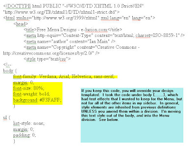
Figure 3: Here's the very next part that you will encounter in the code. We want to skip over this for the moment. We want to create the content or the WHAT, so that when you insert this code into your HTML, you can click preview (without saving changes) to see if you've messed up.
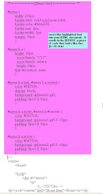 This section represents the 'division' for this menu. It's the section in your HTML document that gives all of the "orders" on HOW to display the content. You will insert this portion of the text in your HTML doc as noted in the blue box in the Figure.
You will want to check the width. If your sidebar is narrower than 200px, you'll want to change the width to something less. Ensure that you know how your main template is sized and the space in which you have to insert these images.
The code is telling web browsers HOW to display the text and the image three ways: (1) as a link; (2) in a hover or mouseover state and (3) as a visited link.
You'll want to use the "Preview" option BEFORE you save changes. You may need to preview many times. Again, PLEASE consider using a test blog.
Figure 4:
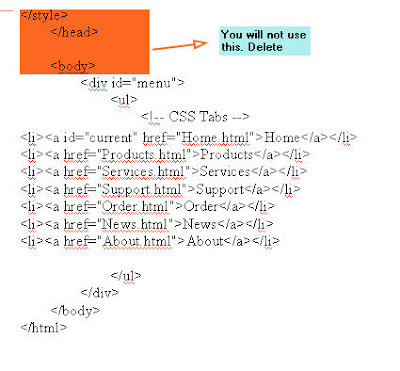 The next bit of code you will not need so either delete it or ignore it. Go to the next image.
Figure 5: This is the part of the document that you are going to "snip" and place in the element that you created.
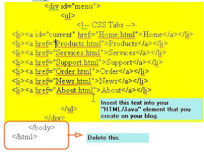 All of the content is what is created in the tab designer--or you could type it yourself. This is an unordered list (ul) which has a link and a label. the li and /li signify the beginning and the end of a line in your list.
Make sure that you do not include the last two lines of text and delete as noted.
Figure 6: This is what your final code in the element you created should look like. WE snipped the top out of Figure 4 and the bottom out of Figure 5 and now we have Figure 6. Repetition can be good.
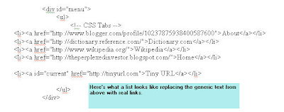
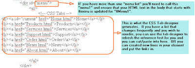 The div id-"menu" corresponds to the #menu style code that you inserted in you HTML doc. (Though I changed gears on you and we want to do this now since you've created the WHAT! If you elect to have more than one menu list (a list of music you like, and another list with other style elements for websites), you will have a #menu1 and a div id="menu1" and so on.
Again, the tab designer software will place the text and/or links that you want. You can also copy and paste within here if you are feeling intrepid and it's not hard to do so, but you have to get all of the tags correct. Plus, it can get a little messy, particularly if you have long website labels.
Figure 7: MY final element using my example.
 Here's what my list looks like on my test blog in my element section called, "New Menu Test" and with real links. You can visit my Test Blog here.
Figure 8: Now we are going to go back to the HOW--which is Figure 3.. I want to tell you a bit about the mechanics.
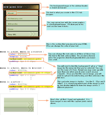 Remember, this is the final presentation--but for this chronology, you've not done this yet. This is where we go back to inserting the code in the HTML doc in Figure 3. A reminder that the code in Figure 3 tells browsers HOW to display the graphics. Your "element" work tells it WHAT to display and WHERE (the 'elements' are movable from sidebar, to bottome to top).
In this example, my subheaders are images that I created in Adobe Photoshop. I uploaded it to box.net. The web browser knows to go there, get the .gif put it on the page as noted. My element tells the browser the content, or the what.
So what you see to the left is nothing but directions. The menu graphics (which I thought were neat--yes, I realize that they don't go with my blog, but I was trying to get something specific to work) are something that you'll need to search for on your computer, save and uploaded.
Figure 9:
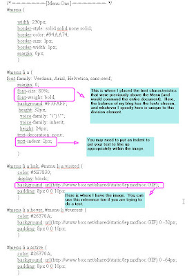 Here's my FINAL code in the HTML document that I inserted. Once you are done with inserting your code, you will want to use the preview button to see how it works (or doesn't).
I hope that you have found this helpful. If' I've something wrong, please leave me feedback. Remember, I'm an amateur, and there may be an easier way.
Customizing your own blog and giving it your own look and fill can be very rewarding. I want to leave you with a few resources.
- Help with colors: IF you are interested in seeing a super color wheel and to get colors that make sense go here (click on graphic)

- Blogger Buster: Amanda's site for help with different things.
- Screen Shots: As you blog and want to share things with your readers, you'll want a great screen capture tool. I highly recommend: Hypersnap from Hyperionics.
No comments:
Post a Comment