Saturday, March 27, 2010

Weekly Sector Report | Expanded View (W/E 03/26/10)

Perspective is everything, and we gain perspective by comparing one thing to another. I wanted to build some sector and market perspective for you. How? By providing you with the following:

  • time series of when different sectors peaked1
  • current retracement to peak in absolute terms1
  • percentage decline from peak to trough
  • percentage of points lost retraced
  • percentage retracement to trough

1 contained in Table 1 below

Table 1


There are a couple of things that are notable from this chart

  • It has been more than three years since the financial sector topped
  • There was 16 months from the topping of the first sector (Financials) to the last sector (Commodities)
The next table, Analysis of Sectors: Peak, Trough and Comparison to Total Stock Market Index (sorted by % gain from trough), will give you view of the sectors that have recovered the most since their trough:

Table 2


Now that I've provided you with that, we'll return to our previously schedule program. Below are the 24 Summary Sectors. You can find the complete report on the 164 DJUS Sectors in addition to weekly + daily chart books for the sectors below here.


I hope that you found this expanded report helpful to providing to you some perspective on relative time and price performance among the 24 sectors that I highlight for you each week. You can also see the disparate nature of BOTH time and price performance through a major cyclical decline and recovery. While this information is unlikely to make interesting cocktail conversation, it is a useful mosaic of information to inform your investing/trading thinking.

I will post periodic updates to the peak/trough tables.

All data courtesy of Stockcharts.com | Compilation and analysis courtesy of me.

Wednesday, March 24, 2010

Market Wisdom by Selden

I wanted to share one of Selden's quotes (there are so many of them that resonate). From Psychology of the Stock Market:


To a great extent we train our judgment to lend itself to our selfish interests. . . We cannot work for our own interests as in other lines of business--we can only fit our interests to the facts. . . To make the greatest success it is necessary for the trader to forget entirely his own position in he market, his profits or losses, the relation of present prices to the point where he bought or sold, and to fix his thoughts upon the position of the market. (p.57)


Sunday, March 21, 2010

Sunday Musings

My blog has been a blight of late outside of my Weekly Sector posts. Today we had a glorious Summer day in Spring! I grabbed my camera and took some shots. I have Adobe Photoshop (full version), and I found some helpful videos at Luv2Help. I used this tutorial and was able to produce these two images. I thought them kind of cool and wanted to share them with you.

I learned in 4 minutes, what would have taken hours for me to figure out. The internet provides so many opportunities for us to enrich our learning.


Weekly Sector Report: 03/19/10

The total stock market index went up .65%. Below are the sectors, sorted based on their weekly change.


I've prepared a full report of all of the DJ US Sectors that you can find here.  Of the 164 sectors
  • 73.8% were positive v. 76.2% last week
  • Average increase was .6% v. 1.10% last week.

I wanted to append to this post a small blurb about why it is even important to look at sectors. I've limited my posting to just delivering the facts.  However, today I wanted to give a little more of the "why" to the "what".

Many people only trade one index or another.  If the S&P is your weapon of choice, then it is important for you to understand its composition. In fact, that understanding should also extend to any ETF as there are a handful of stocks that make up a large part of the weighting. Standard and Poor's has a very good website.  You can find the daily composition of the S&P 500 here.  Their website used to allow you to pick any single day in history and get the composition.  Unfortunately they ceased providing that. 

Nevertheless, I had some old data that I captured.  I want to share with you a "Then v. Now" look.  Below is a table of the S&P as of October 2008 by the market capitalization of its sectors.  I've included a comparison as of EOD 03/19/10. 


You can see clearly that the change in composition among sectors is material.  Money flows in/out of stocks, stocks exist in sector, and the broader indexes are a composite of that underlying movement. The dynamic does not exist in the reverse.  Accordingly, dull index action may belie exciting dynamics of underlying sector rotation. 

While the above breakdown is for the S&P 500 to be illustrative of the material movements underneath the index, the sector information that I provide is for ALL US Stocks using the Dow Jones classification methodology/system (there are different classification systems). Different indices will select these based on market capitalization.

If these sector looks have created an interest on your part, I want to provide you with some resources:

  • WSJ Industry Group Tracker: This source lists the daily performance in addition to other periodicities (e. g. weekly, 1 month, etc).  I'm unsure if this is available to non-subscribers.
  • FINVIZ:  This site (FREE!!!)  provides one of the best way to quickly see charts and other information on stocks in sectors. Unfortunately they do not have broad sector roll ups. You can use their tickers to easily upload sector charts into your software of choice for chart reviews.  The information can also be downloaded into a spreadsheet.
  • Yahoo Finance:  Yahoo has broad sector roll ups, but some of the market capitalizations are incorrect (e.g. the foreign money center banks). 
Your eyes might be crossed at this point, and you may well be wondering why any of this is important. It may not be important to you.  But I believe that the sectors offer a dimension of information that informs whatever work you do on the S&P.  And where opportunities are flat on the index because of underlying sector rotation, opportunities abound (long and short) on the sectors. 

The presentation of my work here is to give you a divining rod for finding the flow of money beneath the surface.  I tend to analyze from the top (broad sector) down (sub-sector, then individual charts).  That is my style.  It may not be yours. There are many ways to skin this cat, and however you do it you need a sharp knife and skill in which to wield it.


Sunday, March 14, 2010

Weekly Sector Sort

Th total stock market index went up 1.11%. Below are the sectors, sorted based on their weekly change. 


I've prepared a full report of all of the DJ US Sectors that you can find here.  Of the 164 sectors
  • 76.2% were positive v. 99.4% last week
  • Average increase was 1.10% v. 4.04% last week.
The full report also includes weekly and daily charts of the broad sectors above.

All date is courtesy of Stockcharts.com |  Compilation is courtesy of me.


Saturday, March 06, 2010

Wondering Out Loud: High Short Interests and Market Psychology

The stock market has been lurching forward with surprising force. For armchair economists, one looks about and can only head scratch about the anomalous behavior of the market v. 'reality.' While the market is a discounting mechanism, I will go to my grave believing that it is as perfect at discounting as a teenage boy is at restraint. Marc Faber's cogent observation that economic reality and the market's perception of economic reality are two different things was an important "AHA" experience for me.

Another important quote that I found in going through my blog archives was one given to me by a fellow blogger from Bill Cara's site. It was attributed to George Soros, though I've never verified that:

“Economic history is a never-ending series of episodes based on falsehoods and lies, not truths. It represents the path to big money. The object is to recognize the trend whose premise is false, ride that trend, and step off before it is discredited."


G. C. Selden writes in his book, Psychology of the Stock Market the following:


The main point of their argument is that the state of mind of a man short of the market is radically different from the state of mind of one who is long. Their whole study, in such a conversation, is the mental attitude of those interested in the market. If a majority of the volatile class of in-and-out traders are long, many of them will hasten to sell on any sign of weakness and a decline will result. If the majority are short, they will buy on any development of strength and an advance may be expected."


And that leads me to this:


Is it possible that 100% of the IWM is really short? Forty percent of the SPY? If these numbers are true, is it any wonder then that we have these surges of buying on moderate strength? To my amateur eye, these high levels of short interest preclude a major correction until they are reduced. However, I do find these numbers a bit troublesome, as I'm having a difficult time corroborating any by the SPY (FINVIZ reports 44%). I cannot find numbers for the others. The numbers (should one be able to find credible numbers) bear watching.

Friday, March 05, 2010

Weekly Sector Update: 03/05/10

It was a week of strong, forward movement in all of the 164 DJ US Sectors except for one--Water--which was down 2.1%. Here are the broad sectors, all of which were solidly positive.


On the weekly charts, I'm seeing several sectors that are making new highs, but the ultimate oscillator is not confirming. It's a divergence worth keeping an eye on. You can find the full report here.

Data courtesy of Stockcharts; compilation courtesy of me.

Thursday, March 04, 2010

Quantum Mechanics and Trading

Calabi-Yau manifold

I've many books in my bookshelf that beg reading, none more compelling than Brian Greene's, The Fabric of the Cosmos: Space. Time. And the Texture of Reality. Greene is a theoretical theorist--a mind that dwells in the stratosphere of conceptual thought.

Greene is that wonderful composite of rocket scientist and gifted writer, making his work accessible to mere mortals. Rather than reading equations, such as this. . . .


g_{i\bar{j}} = \frac{\partial^2 K}{\partial z^i \partial \bar{z}^{j}}

(Photo courtesy Wikipedia)

. . . I'm blessedly spared both the headache of trying to hum along with some

lip mumbling--even spurts of drooling --and the shame of having to admit that
I've not understood a thing. Rather, I simply need to read one of his
beautifully crafted books.

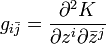
There was a terrific blog post by Gmak, a fellow Slope of Hope blogger, regarding technical analysis. It engendered a very good discussion. I was particularly happy to see it as I had become cross eyed looking at a number of charts whose ultimate destination seemed unfathomable (like our drawing above). "Now what does any of this have to do with trading?" you might ask impatiently (is that your toe I hear tapping? ).

I ran across two passages in this book that I wanted to share.

Understanding_copy

The second I wanted to commit to a post, because I thought that is was
something worth reading. I quote from page 11.


But according to the quantum laws, even if you make the most perfect
measurements possible of how things are today, the best you can ever hope to do
is predict the probability that things will be one way or another at some chosen time in the future, or that things were one way or another at some chosen time in the past. The universe, according to quantum mechanics, is not etched into the present; the universe, according to quantum mechanics, participates in a game of chance.

. . . most physicists agree that probability is deeply woven in to the fabricof quantum reality. Whereas human intuition, and its embodiment in classical physics, envision a reality in which things are always definitely one way or another, quantum mechanics describes a reality in which things sometimes hover in a haze of being partly one way and partly another. Things become definite only when a suitable observation forces them to relinquish quantum possibilities and settle on a specific outcome. The outcome that's realized, though, cannot be predicted--we can predict only the odds that things will turn out one way or the other. (p.11)


Running across this passage so quick on the heels of our having a
conversation about TA and its 'predictive' abilities, made it resonate deeply. I
could not help but note that trading/TA is not so far from quantum mechanics.

When your capital is on the line, probabilities must be considered carefully--and none more judiciously than the probability of your being wrong in a trade. As our trading is fraught with our successfully managing (surviving) uncertainty, I thought the passage timely and insightful.

Our technical analysis, for all of its purported faults, is a construct that gives us understanding and cultivates insight. More importantly, our TA and our trading plan anchors those insights. It is not predictive, but it does reveal to us the promise of certain outcomes. To those promises we must overlay our trading discipline. We are not really trying to managed the outcome of a chart, rather we are managing the outcome of the relationship of our trading capital with the chart. Accordingly, our trading discipline is the construct of that universe of uncertainty. Most importantly, we are the final arbiter of those rules those rules dictate the outcomes. That is great power, is it not?

We really are masters of our own universe.

Super