Summary
The total market $DWCF advanced 1.66% this past week. We'll look at the relative performance of sectors driving this change.
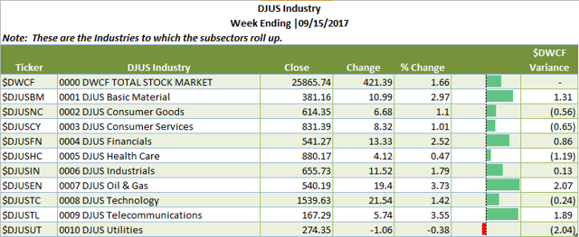
- Oil and Gas (+3.73%) and Telecommunications (+3.55%) were the top performing industries. Heads up: both have been laggards this year.
- Utilities (-.38%) and Healthcare (+.47%) were this week's industry relative underperformers.
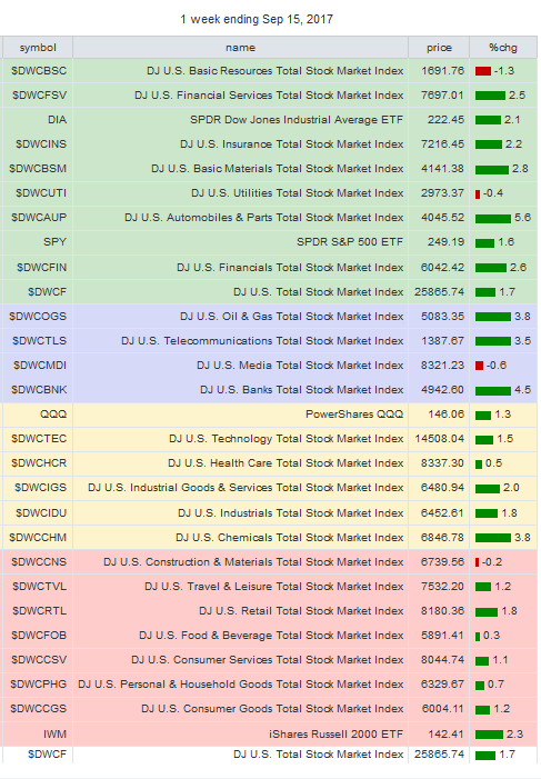
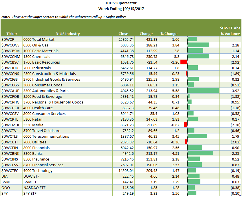
- The major ETF's were all positive: DIA +2.14%, IWM +2.29%, QQQ +1.28% and SPY +1.56%.
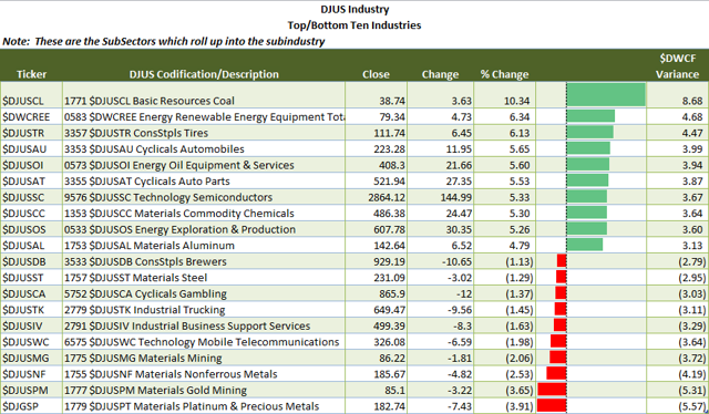
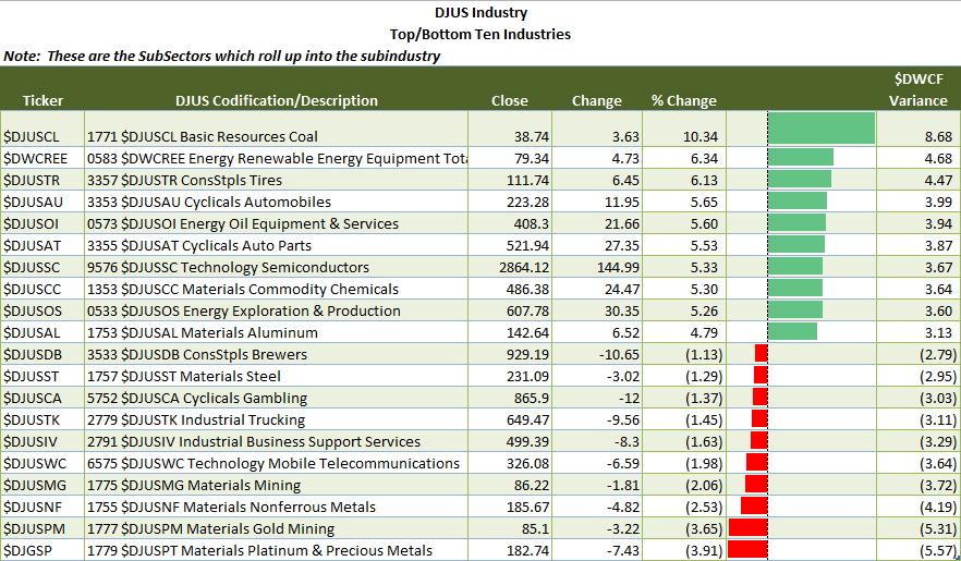
- Under subsector performance, Coal (Basic Materials) was this week's leader at +10.34%; Platinum and Precious Metals (Basic Materials) was this week's loser at -3.91%.
Note: The information contained in this post is in summary form. You can download a full report in PDF format here.
It contains all of the summary tables contained herein plus weekly
charts for the SuperSectors + the SPDR ETF's. Unless otherwise noted,
all information is sourced from Stockcharts.com
Overview: The weekly sector report is designed to give you a a bird's eye view of relative sector performance among the industries, supersectors and subsectors using the S&P/DowJones Sector classification. (Get your copy in Excel here).
Using relative sector performance provides a great way to use a top down approach to find underlying stocks that fit your personal investment/trading style. Further, looking at relative performance among sectors on a continual basis helps highlight where money is moving to/from and where to look for attractive long/short opportunities.
With that said, let's take a top down look.
Industry View: Below are the 10 major Industries plus the Total Stock Market Index ($DWCF). For the purposes of relative performance $DWCF is used. Table 1, below, summarizes these industries under which more granular the supersectors/sectors/subsectors reside.
Table 1 | Industry View
Supersector View. Beneath the Industry View, there is a SuperSector View. Super Sectors roll up into Industries. SuperSectors are segmented further into Sectors (which I omit here) and then into Subsectors. Table 2, below, summarizes the Supersector performance.

SubSector View: SubSector view is the most granular view with a count of 106 subsectors. While the list is too large to detail here, it is in the weekly report sorted both by sector and sorted by performance for ease of use. Table 3, below, details the Top 10 Winners and Losers in the SubSector view.
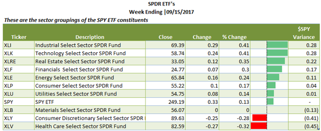
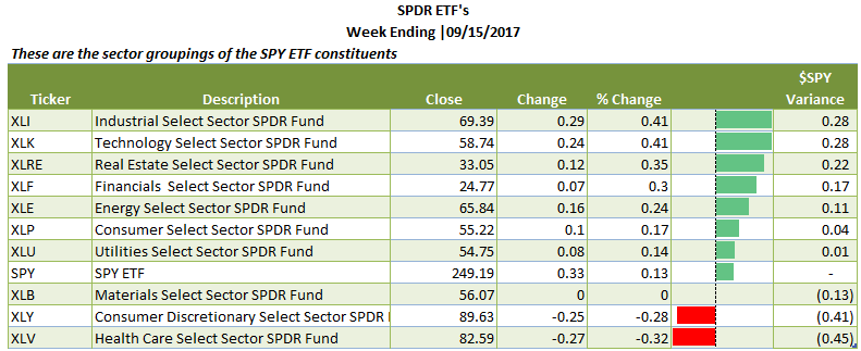
SPDR Sector ETF View: As many are familiar with the SPDR ETF Sector views, essentially the S&P 500 stocks (a sub-population of the universe of stocks) divided by industry classification, I provide that summary table for you, sorted from best to worst performers. I've also included the charts in the chart book.
Table 4 | SPDR Sector ETF's (sorted by performance)
Relative Rotational Graph (Table Form): In conclusion, I want to leave you with a relative rotational graph (in tabular form). I think that it is a nice one year exposition of the relative performance among SuperSectors + Major Index ETF's compared to the total stock market ($DWCF). The % change is for one week, but the relative performance is for 1 year. Color coding is as follows: Green=Leading; Yellow=Weakening; Red=Lagging and Blue=Improving.
Table 5 | SuperSector + Index ETF's Relative Rotational Graph (courtesy of Stockcharts.com)
I hope that your found this Weekly Sector Report helpful as part of your market preparation.
Overview: The weekly sector report is designed to give you a a bird's eye view of relative sector performance among the industries, supersectors and subsectors using the S&P/DowJones Sector classification. (Get your copy in Excel here).
Using relative sector performance provides a great way to use a top down approach to find underlying stocks that fit your personal investment/trading style. Further, looking at relative performance among sectors on a continual basis helps highlight where money is moving to/from and where to look for attractive long/short opportunities.
With that said, let's take a top down look.
Industry View: Below are the 10 major Industries plus the Total Stock Market Index ($DWCF). For the purposes of relative performance $DWCF is used. Table 1, below, summarizes these industries under which more granular the supersectors/sectors/subsectors reside.
Table 1 | Industry View

Supersector View. Beneath the Industry View, there is a SuperSector View. Super Sectors roll up into Industries. SuperSectors are segmented further into Sectors (which I omit here) and then into Subsectors. Table 2, below, summarizes the Supersector performance.
- Range of SuperSector performance runs from -1.26% for Basic Resources to +5.58% for Automobiles and Parts.
- In addition to the SuperSectors, I have included the major ETF's for comparative purposes. The number in front of the ticker description is based on the numbering of the S&P/DowJones indexing--it serves as an index number using the first digit for the Industry, and the 2nd digit for the SuperSEctor, the 3rd digit for the Sector and the 4th digit for the Subsector. For example anything beginning with a 5 is Consumer Services (e.g. 5000, 5300, 5550, 5700).
- For chart lovers, I have included a weekly chart book for each of the below as well as for each of the SPDR Sector ETF's (see Table 4).
SubSector View: SubSector view is the most granular view with a count of 106 subsectors. While the list is too large to detail here, it is in the weekly report sorted both by sector and sorted by performance for ease of use. Table 3, below, details the Top 10 Winners and Losers in the SubSector view.
- Note the difference in performance among subsectors that are part of the same industry (Coal +10.34% v. Platinum and Precious Metals -3.91%). This level of detail can be hidden by looking at a higher roll up (sector/supersector/industry, respectively) which is why I break it out here.
SPDR Sector ETF View: As many are familiar with the SPDR ETF Sector views, essentially the S&P 500 stocks (a sub-population of the universe of stocks) divided by industry classification, I provide that summary table for you, sorted from best to worst performers. I've also included the charts in the chart book.
Table 4 | SPDR Sector ETF's (sorted by performance)
Relative Rotational Graph (Table Form): In conclusion, I want to leave you with a relative rotational graph (in tabular form). I think that it is a nice one year exposition of the relative performance among SuperSectors + Major Index ETF's compared to the total stock market ($DWCF). The % change is for one week, but the relative performance is for 1 year. Color coding is as follows: Green=Leading; Yellow=Weakening; Red=Lagging and Blue=Improving.
Table 5 | SuperSector + Index ETF's Relative Rotational Graph (courtesy of Stockcharts.com)
I hope that your found this Weekly Sector Report helpful as part of your market preparation.


