Financial services had a lousy weekly largely due to V and MA getting their legs cut out from under them with the proposed regulations on capping debit card fees. To get a view of the magnitude of the market's response on these two charts click here.
The WSJ Industry page as a great snapshot of the best/worst performing industries. Here's the snapshot for this week:
You can choose from multiple time frames to see this type of performance. These types of relative looks will help build a mental map for you to gauge market action. Click here to see how this easy visual tool works.
I had a reader ask me a question about being able to find low-risk entry points using these sector reports. There are a number of FREE on-line tools to aid the individual investor who wants to do his/her own research. Ultimately we want to be in the industries that are attracting money relative to other industries, and be in the strongest performing stocks (attracting money relative to its sector siblings). By clicking on any of the industry links, you can also see a snapshot of the strongest performing stocks in that sector. (You can also do this easily in FINVIZ by clicking here. )
As steel was a great performing industry this past week, I wanted to share a couple of charts, the weekly and the daily, with you.
WEEKLY Steel Chart
Daily Steel Chart
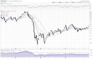
Time to pull back out for the bigger picture. Let's take a look at the total market index:
We are fast approaching a volume bar (see dotted line) that should we surpass it, the gravity of volume overhang will dissipate. What is interesting to me is that we often come to these important technical junctures that are coincidental with important news junctures--the next big news cycle being 4th quarter earnings and of course the report from the retail sales.
I have a good friend that reminds me, "There are no coincidences."
I have prepared for you a chart book with the weekly and daily sector charts. You can find it here. It is a large file, so be patient with the download.


